Your website typography shapes how visitors perceive your brand within seconds, and Weebly gives you more control over it than many beginners expect. If you are wondering how to change font on weebly without breaking your theme or making pages look inconsistent, you are in the right place. The platform allows site-wide updates through theme settings, targeted edits for headings and body text, plus custom code options for Google Fonts and uploaded typefaces. In this article, you will learn exactly where font controls live, how to update default styles for paragraphs, titles and navigation, and how to apply custom fonts to specific sections. You will also see how to adjust size, color, spacing and mobile display, fix common issues when changes do not save, and choose pairings that keep your site readable and professional. No coding experience is needed for most methods, and I will walk through each option with clear steps you can follow right away.
Weebly Font Controls and Theme Defaults
Weebly manages fonts at two levels, theme defaults and page content. Theme defaults control the base look for headings, paragraphs, navigation menus and buttons across your whole site. Page content edits let you override those defaults for a single text box.
Most beginners start by changing text directly in the editor, then get frustrated when new pages revert to the old style. That happens because direct edits do not update the theme default. Learning where each setting lives saves time and keeps your branding consistent.
Where Weebly Stores Font Settings
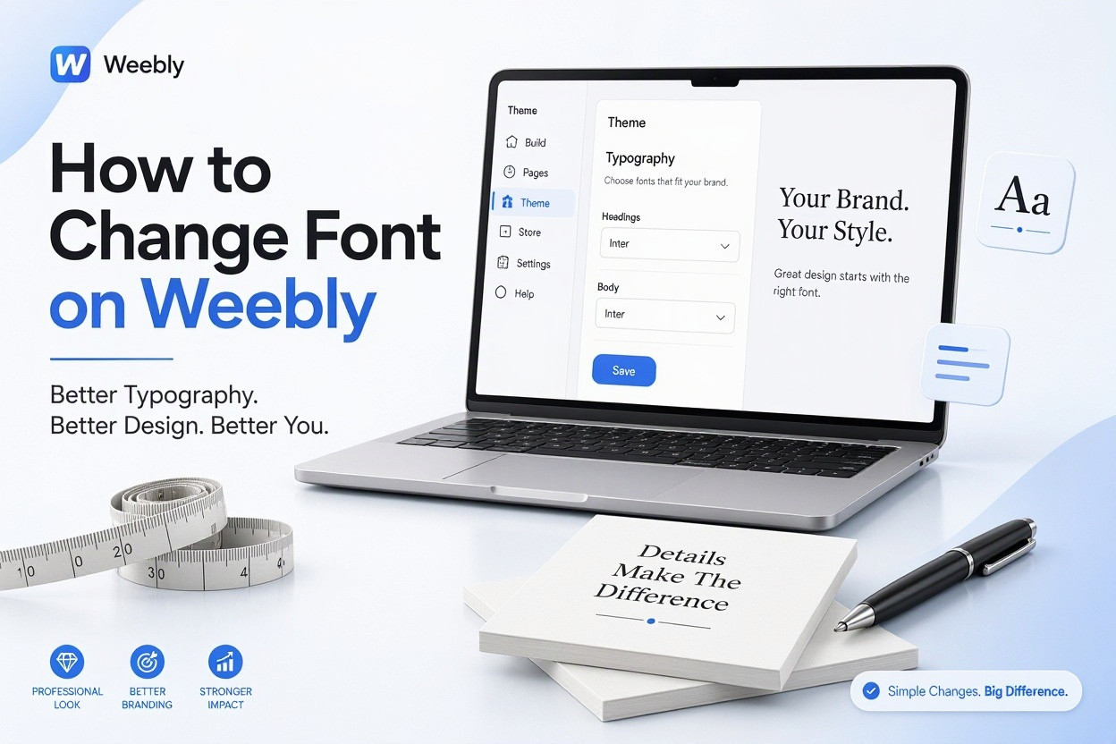
Open your site editor and click Theme, then Change Fonts in the left panel. This area lists text types like Site Title, Paragraph, Headings, Navigation and Buttons. Each entry lets you set family, size, weight, color and spacing.
Changes made here apply globally. If you update Paragraph to Open Sans 16px, every paragraph using the default style updates at once. This is the fastest way to clean up a site that uses mixed fonts.
Difference Between Theme Fonts and Inline Edits
Inline edits happen when you highlight text and change it with the small toolbar. Those edits affect only the selected words. They are useful for emphasis, such as making one phrase bold or italic.
Theme edits set the foundation. Inline edits sit on top of that foundation. If you rely only on inline edits, your site becomes hard to maintain. Set strong defaults first, then use inline tweaks sparingly for highlights or callouts.
Changing Site-Wide Fonts From Theme Settings
The Change Fonts panel is the best starting point for a full refresh. You can switch your body font from a serif to a clean sans-serif in under a minute. Headings can use a bolder companion face for contrast.
Take a moment to preview each change on desktop and mobile. Weebly shows live updates, so you can test readability before you publish. Small size increases often make a big difference for older text-heavy themes.
Editing Paragraph and Heading Styles Together
Body text and headings should work as a pair. Choose a highly readable option for paragraphs, like Lato, Proxima Nova, Montserrat Light or Source Sans. Reserve decorative or heavy fonts for H2 titles and your site title.
Keep the hierarchy clear. Your H1 should be noticeably larger than H2, and both should stand apart from body copy. Consistent spacing between headings and paragraphs also improves scanning on long pages.
Saving and Previewing Your Theme Changes
Weebly saves theme font edits automatically as you work, but you still need to publish to make them live. Use the Preview button to check key pages, including blog posts and contact pages that often use different layouts.
Clear your browser cache if the preview looks outdated. Older theme files sometimes stick around for a few minutes. Checking in an incognito window gives you a clean view of what visitors will see.
Exact Steps to Update Default Fonts in Weebly
1. Log in to Weebly, open your site and click Theme in the top navigation bar.
2. Select Change Fonts from the left sidebar to open the typography panel.
3. Click Paragraph, choose a font family, then set size, line height and color.
4. Click Title and Headings and assign a complementary heading font and weight.
5. Update Navigation, Buttons and Site Title so menus match your new style.
6. Preview on desktop and mobile, then click Publish to push changes live.
Customizing Fonts for Individual Blocks and Pages
Site-wide settings create consistency, but some pages need special treatment. A landing page headline might need a larger, bolder style than blog headings. Weebly lets you adjust single blocks without touching the global theme.
Click any text box to reveal the formatting toolbar. You can change family, size, color and alignment for that block only. Use this for hero sections, testimonials, pricing tables or limited-time announcements that should stand out.
Styling Titles, Paragraphs and Buttons Separately
Each element has a different job. Titles grab attention, paragraphs carry information, buttons drive clicks. Give buttons a heavier weight and slightly tighter letter spacing so they feel actionable.
Avoid styling every paragraph differently. Pick one body style and stick with it across pages. Reserve unique treatments for page titles and featured quotes. This balance keeps pages interesting without looking scattered. For more layout ideas, see [Internal Link: Weebly Website Design Tips] woven into your planning process.
Using the Text Editor Toolbar Effectively
The toolbar appears when you select text inside a Text element, Title element or blog post. You can switch fonts, adjust size with the dropdown, add bold or italic, change color and create links.
Use the Paint format option carefully. Pasting from Google Docs or Word often carries hidden styles that override your theme. Paste as plain text first, then apply Weebly formatting. This prevents mismatched sizes and odd line breaks.
Adding Custom Fonts With Google Fonts and Embed Codes
Weebly includes a solid library of standard fonts, but you may want something more distinctive. Google Fonts offers hundreds of free options like Poppins, Playfair Display, Raleway and DM Sans that work well on Weebly sites.
You can add these fonts without upgrading to an expensive plan. The typical method involves adding a font link in the header and referencing it with a small CSS rule. Once set up, the custom font appears alongside built-in choices.
Connecting a Google Font to Your Weebly Site
Go to Google Fonts, select your typeface and copy the embed link. In Weebly, go to Settings, then SEO, then Header Code, and paste the link tag. Publish the site so the font file loads.
Next, go to Theme, then Edit HTML slash CSS, and add a font-family rule for the elements you want to change. For example, assign Poppins to h2 headings and Inter to paragraphs. Test on multiple browsers after publishing.
Applying Uploaded Fonts With Custom CSS
If your brand uses a licensed font, you may need to upload it. Weebly allows file uploads through Assets in the Code Editor. Upload woff and woff2 versions for best browser coverage.
Reference the uploaded file with an at-font-face rule, then apply it to your selectors. Keep file sizes small to avoid slowing page loads. If the font fails to load, specify a close fallback like Arial or Helvetica so text still renders cleanly.
Quick Tips for Working With Custom Fonts on Weebly
- Stick to one custom heading font and one custom body font to avoid clutter and slow loading.
- Always set a fallback stack, such as Poppins, Helvetica, Arial, sans-serif, for offline viewing.
- Test custom fonts on phones, since thin weights can look washed out on small screens.
- Use 400 weight for body copy and 600 or 700 for headings to keep contrast clear.
- Re-check your header code after switching themes, because custom code does not always carry over.
Adjusting Font Size, Color, Spacing and Emphasis
Font family gets most of the attention, but size and spacing affect readability just as much. Cramped line height makes even a nice typeface hard to read. Low contrast between text and background causes eye strain.
Aim for body text between 15px and 18px on desktop. Headings should scale proportionally, with page titles around 32px to 48px depending on your theme. Increase line height to 1.5 or 1.6 for paragraphs with long sentences.
Setting Sizes That Work on Mobile and Desktop
Weebly themes are responsive, but large desktop headings can overwhelm phones. After changing sizes, open Preview and toggle to mobile view. Reduce hero titles by 20 to 30 percent if they wrap awkwardly.
Avoid fixed pixel sizes for every block when possible. Use theme defaults that scale automatically. For manually sized headlines, test on an actual phone, not just the desktop preview, to catch overflow and clipping.
Pairing Colors and Weights for Better Contrast
Dark gray text on white, such as 333333 on FFFFFF, is easier on the eyes than pure black. For colored backgrounds, use white or very light text with a medium weight. Check contrast in bright sunlight conditions.
Use bold sparingly inside paragraphs. Highlight key phrases, product benefits or deadlines rather than entire sentences. Too much bold creates visual noise. Italics work well for quotes, captions and supporting notes. Related guidance on color and layout can be found in [Internal Link: Weebly Site Customization Guide] for deeper styling help.
Fixing Common Weebly Font Display Problems
Font changes sometimes fail to appear after publishing. The usual culprits are browser cache, conflicting inline styles or a theme that locks certain elements. Systematic checks resolve most cases quickly.
Start by republishing and hard-refreshing your browser. Then inspect whether the problem affects one block or the whole site. A single-block issue points to inline formatting. A site-wide issue points to theme code or header scripts.
Fonts Not Saving or Showing Correctly
If your selection reverts after refresh, you may be editing a locked theme area or a copied page with old styles. Return to Theme, Change Fonts and reapply the style at the global level. Then remove local overrides in the affected text box.
For custom fonts, verify the header link is correct and published. A missing closing tag or typo in the font name breaks loading. Check the font name spelling, including capitalization and plus signs for multi-word families like Open Sans.
Inconsistent Fonts Across Pages and Devices
Mixed fonts often come from pasted content or older blog posts created before a rebrand. Open each inconsistent page, select the text, clear formatting and reapply the default paragraph style. This normalizes the underlying HTML.
Device differences usually stem from missing fallbacks or unsupported weights. iOS and Android substitute fonts when a weight is unavailable. Limit your site to weights you actually load, such as 400 and 700, to keep rendering predictable.
Common Mistakes That Cause Font Issues on Weebly
- Pasting from Word without clearing formatting, which embeds hidden font tags.
- Using five or six different families across pages instead of a defined pair.
- Forgetting to publish after editing header code for Google Fonts.
- Setting light gray body text on white backgrounds with poor contrast.
- Overriding theme styles with inline sizes on every block, making future updates tedious.
- Loading too many font weights, such as 300 through 900, which slows page speed.
- Not testing navigation and button fonts, leaving menus in the old style.
Best Practices for Clean and Readable Typography
Strong typography supports your message without calling attention to itself. Limit your site to two families, one for headings and one for body. Add a third only for a logo or special accent, and use it sparingly.
Pay attention to line length. Around 50 to 75 characters per line is comfortable for desktop reading. Very wide text blocks tire readers. Use Weebly columns or narrower sections to control measure on large screens.
Choosing Font Pairings That Look Professional
Pair contrast with harmony. A modern sans-serif body like Open Sans works well with a characterful heading like Merriweather, Playfair Display or Oswald. Keep x-heights similar so the mix feels intentional.
Avoid pairing two decorative fonts. If your heading has strong personality, keep body text neutral. Test pairings with real headlines from your site, not just alphabet samples. Numbers, punctuation and long titles reveal spacing problems early.
Keeping Your Site Fast and Accessible
Each additional font file adds load time. Choose only the styles you need and skip italics or extra weights you never use. Preconnect to Google Fonts in your header to speed up fetching.
Accessibility matters for SEO and usability. Maintain a contrast ratio of at least 4.5 to 1 for body text. Avoid all-caps paragraphs, which are harder to scan. Use true headings for structure rather than enlarging paragraph text, so screen readers interpret your pages correctly.
Conclusion
Font choices influence trust, readability and conversions more than most site owners realize. You now have several reliable paths, from quick theme updates and targeted block edits to Google Fonts integration and light CSS tweaks for uploaded typefaces. Focus on consistency first by setting strong global defaults for body copy, headings, navigation and buttons, then add personality where it counts. Test sizes and contrast on phones as well as desktops, clear old inline styles that cause mismatches, and limit your site to two well-paired families. If you follow those habits, learning how to change font on weebly becomes a simple design task rather than a recurring fix, and your pages will look cleaner, load faster and keep visitors reading longer.
Frequently Asked Questions
Why My Weebly Font Change Is Not Showing?
Clear your cache and republish, then check for inline overrides. Pasted styles often beat theme defaults. Select the text, clear formatting and reapply the default style to fix single-block issues quickly.
Can I Use Google Fonts on a Free Weebly Plan?
Yes, you can add Google Fonts with a header link and simple CSS. Paste the font link under Settings and SEO Header Code, publish, then reference the family in your theme CSS for headings or body text.
Where Are Default Font Settings Located in Weebly?
Go to Theme, then Change Fonts in the site editor. You will find controls for Site Title, Navigation, Headings, Paragraph and Buttons. Edits there update the default style across all pages using that theme.
How Many Fonts Should I Use on a Weebly Site?
Use two fonts for most sites, one for headings and one for body text. A third accent font is acceptable for logos only. More families create clutter, slow loading and make future updates harder to manage.
Do Custom Fonts Affect Weebly Site Speed and Mobile Display?
Yes, each font weight adds download size and can slow mobile loading. Load only weights you use, set system fallbacks and test thin styles on phones. Keep body text at readable sizes for small screens.