If text on your iPhone feels too small to read comfortably, you are not stuck with the default look. Learning how to change font size on iphone takes less than a minute, and it can make messages, emails, menus, and web pages much easier on your eyes. You do not need to install anything or change your phone model.
In this article you will learn the standard method in Display settings, the larger accessibility options for extra-large text, how to make text bold, how to set different sizes for specific apps, and how to adjust Safari page zoom. I will also cover common reasons text does not change, what to do when an app ignores your settings, and practical tips for balancing readability with screen space.
Quick Way to Change Text Size on iPhone
The fastest method works for most people and affects many Apple apps plus apps that support Dynamic Type. You move a slider to pick from seven standard sizes. Changes apply right away, so you can open Messages or Mail to preview the result.
This method does not change everything on the screen. Icons, images, and some third-party app layouts stay the same size. It mainly adjusts text that uses the iPhone system font scaling. If you need even bigger text, accessibility settings go further.
What the Standard Text Slider Controls
The standard slider controls system text in places like Settings menus, Messages conversations, Mail message lists, Contacts, Calendar, Notes, and many App Store apps that support text scaling. When you drag it right, body text and headings grow proportionally.
It keeps the overall layout intact. Your Home Screen grid and Control Center buttons will look the same, but words inside supported apps become taller and wider. This is ideal when regular text is slightly uncomfortable but you still want a normal amount of content on screen.
What the Slider Does Not Change
The slider will not enlarge keyboard letters, status bar icons, or pictures inside messages. Some apps with custom fonts or fixed designs may ignore it completely. Games, photo editors, and certain banking apps often use their own text rendering.
If only one app looks small while everything else looks good, the issue is usually app-specific. In that case, per-app settings or in-app display options are a better fix than raising the system-wide size again.
Adjust Text Size in Display and Brightness Settings
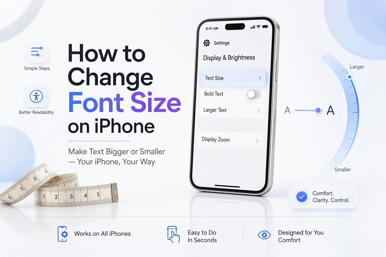
The Display and Brightness section is the main starting point for everyday text adjustments. It is designed for general comfort rather than vision accessibility needs. Most users find a comfortable setting between the fourth and sixth positions on the slider.
Open Settings, tap Display and Brightness, then tap Text Size. Drag the slider left for smaller text or right for larger text. Leave Settings open in the background and switch to Messages to see the difference before you settle on a size.
Follow These Steps in Order
1. Open the Settings app from your Home Screen or App Library.
2. Tap Display and Brightness.
3. Tap Text Size.
4. Drag the slider to increase or decrease the text size.
5. Press the Back button or swipe to return, then open a supported app to check readability.
6. Repeat until body text feels comfortable without too much scrolling.
For most users, moving one or two notches larger is enough. Moving to the maximum standard size will make lists and emails take up more vertical space, so you will scroll more often. Test both a message thread and an email inbox, since line length looks different in each place.
Quick Tips for Everyday Use
- Start with one notch larger and use your phone normally for a day before going bigger.
- Check Notes and Reminders after changing, because longer titles may wrap to two lines.
- If text looks blurry rather than small, check Screen Zoom and Display Zoom instead of text size.
- Use Night Shift or True Tone at night if eye strain continues after enlarging text.
- Add Text Size to Control Center for faster adjustments without opening Settings.
Pairing a modest text increase with bold text often improves clarity more than using maximum size alone. This keeps more content visible while still reducing strain.
Make Text Bold for Better Readability
Bold text darkens letters across menus, message bubbles, and many system screens. It does not make letters much larger, but thicker strokes improve contrast. Many people with mild vision difficulty find this more helpful than a small size increase.
You can turn on bold from the same Display and Brightness screen. Tap the toggle next to Bold Text, then confirm when your iPhone asks to restart. The restart takes only a few seconds and your apps and data remain unchanged.
How Bold Text Looks in Practice
In Messages, contact names and message text appear heavier and easier to scan quickly. In Settings, menu labels stand out more clearly against the white or dark background. In Mail, subject lines become easier to distinguish from preview text.
The difference is subtle on newer OLED screens with high contrast, but noticeable on older LCD models or in bright sunlight. If you use Dark Mode, bold plus white-on-black text can be especially readable without needing very large letters.
When Bold Text Helps Most
Bold text helps when you can see the shape of letters but they look thin or washed out. It is useful for outdoor use, for older users, or for anyone who reads quickly and wants headings to stand out. It also helps when screen brightness must stay low to save battery.
It will not solve the problem if letters are physically too small to distinguish. In that situation, combine bold with a larger size setting. Turn bold on first, then adjust size one step at a time until extended reading feels comfortable.
Enable Larger Text With Accessibility Options
If the standard slider does not go large enough, accessibility settings unlock extra-large sizes. These sizes are intended for low vision and can make text dramatically bigger. Some app layouts will reflow or truncate buttons at these extremes.
Go to Settings, tap Accessibility, tap Display and Text Size, then tap Larger Text. Turn on Larger Accessibility Sizes, then drag the slider to the right. You will see sizes far beyond the standard seven options.
How Larger Accessibility Sizes Work
These sizes use the same Dynamic Type system but allow scaling well past normal limits. Supported Apple apps will wrap text, enlarge headings, and stack buttons vertically when needed. Third-party apps vary, with well-designed apps adapting smoothly and older apps cutting off edges.
Expect more scrolling and occasional layout quirks. Tab bars may show fewer labels, and long email subject lines may wrap to three lines. This tradeoff is normal when prioritizing legibility over information density.
Important Facts About Accessibility Text
- Larger Accessibility Sizes affect all apps that support Dynamic Type, not just one app.
- Some apps require a restart before the largest sizes take full effect.
- Very large text may cause overlapping buttons in older apps that have not been updated.
- You can combine larger text with Button Shapes and On/Off Labels for clearer navigation.
- If layout breaks badly, reduce one notch rather than turning the feature off completely.
For daily use, many people settle on the first or second accessibility notch rather than the maximum. That setting is usually large enough for comfortable reading while keeping most app screens usable. Reserve the largest two positions for temporary needs or severe vision difficulty.
Common Mistakes That Reduce Readability
- Setting text to maximum immediately, which causes excessive scrolling and frustration.
- Turning on both Zoom and largest text at once, which magnifies an already magnified layout.
- Forgetting to test third-party apps after a change and assuming they will match Apple apps.
- Using low brightness with small gray text, which hurts contrast more than size helps.
- Ignoring bold text and contrast settings that could solve the problem with less disruption.
A balanced approach works best. Increase size gradually, check your three most-used apps, then add contrast or bold only if needed.
Set a Different Font Size for Specific Apps
Recent iOS versions let you set text size per app. This is useful when you want large text in Mail and Messages but normal text in Safari or a banking app where layout matters. It avoids the compromise of one global size.
Go to Settings, tap Accessibility, tap Per-App Settings, then tap Add App. Choose the app, tap it in the list, then tap Text Size and pick Small, Default, Large, or one of the larger accessibility levels. The chosen app will use that size while other apps stay unchanged.
Practical Examples for Per-App Settings
Set Mail to Extra Large if you read long newsletters on your phone but keep Maps at Default so street names and directions fit on screen. Set Messages to Large for comfortable chats while keeping Calendar compact to see more events per day.
News apps and e-book readers benefit from larger per-app text because they involve long reading sessions. Productivity apps with dense tables or small buttons often work better at Default. You can add multiple apps and tune each one separately over time.
How to Switch Sizes Quickly From Control Center
You can add a Text Size control to Control Center for fast changes without digging through Settings. Open Settings, tap Control Center, then add Text Size to Included Controls. Swipe down from the top-right corner to open Control Center and tap the Text Size icon.
At the bottom of that control you will see a toggle for the current app versus all apps. This lets you adjust only the app you are using or change the global setting. It is the fastest way to test different sizes while reading.
Adjust Font Size in Messages and Mail
Messages and Mail follow system text size, but each has small behaviors worth knowing. In Messages, conversation bubbles, contact names, and the message list all scale. Photos, stickers, memos, and timestamps scale less or stay fixed.
In Mail, the inbox list, subject lines, and message body scale when the email uses standard formatting. Some HTML newsletters use fixed styles and may stay small. In that case use pinch-to-zoom or Mail formatting options rather than raising system text again.
Checklist for Reading Comfort in Messages and Mail
- Confirm standard text size is at least middle position or higher.
- Turn on Bold Text if names and subjects blend together.
- In Mail, use the Format button to increase quote level readability when replying.
- Pinch outward on a stubborn newsletter to zoom temporarily.
- Reduce Motion off does not affect size, but Increase Contrast can help pale gray preview text.
- Test both portrait and landscape, since line width changes readability.
If message bubbles still feel cramped, try the first accessibility size rather than maximum standard. That one step often fixes long thread readability without making the keyboard or navigation bar feel oversized. Many users pair this with [Internal Link: Change Display Brightness on iPhone] adjustments for evening reading comfort.
Change Safari Web Page Text Size
Safari handles text differently from system apps. Websites control their own fonts, so system text size does not always apply. Safari provides its own page zoom and text size controls that work per website.
Tap the Page Menu icon in the address bar, usually shown as aA or as a page icon depending on iOS version. Tap the small A to reduce size or the large A to increase size, from 50 percent to 300 percent. Safari remembers the setting for that website.
Set a Default Page Zoom for All Websites
Open Settings, tap Apps or Safari depending on your iOS version, tap Page Zoom, then choose a default percentage. You can set 100 percent as default and assign larger percentages to specific sites you read often, like news or recipe blogs.
This is better than raising system text if only web articles feel small. It keeps apps normal while making web paragraphs comfortable. If a site layout breaks at 150 percent or higher, try Reader View first, which strips clutter and uses clean scalable text.
Use Reader View for Cleaner Articles
When available, tap the Reader icon in the address bar to show a simplified article layout. Tap the aA button inside Reader to adjust font, including larger serif or sans-serif options, plus background color.
Reader View is ideal for long articles with ads, popups, or narrow columns. You can raise Reader font size without affecting the rest of the web. Exit Reader to return to the normal site design when finished.
Troubleshooting Text Size Issues
Sometimes text does not change after you move the slider. The most common cause is an app that uses custom fonts and ignores Dynamic Type. Close and reopen the app, then check if it has its own Text Size, Display, or Appearance setting inside the app.
If system apps do not respond, restart your iPhone. A restart refreshes font caching and applies bold or accessibility changes fully. Also check Screen Zoom under Display and Brightness, because Display Zoom Standard versus Zoomed interacts with text layout.
Do and Do Not List for Reliable Results
Do update iOS before troubleshooting, since per-app text and accessibility scaling improve with updates.
Do test with Apple Notes to confirm whether the issue is system-wide or app-specific.
Do check Content Restrictions if Settings options look grayed out on a managed device.
Do not enable full-screen Zoom unless you need magnification, since it complicates navigation.
Do not assume larger is always better, since extreme sizes can hide buttons and menus.
Do not change multiple settings at once, or you will not know which one fixed the problem.
If text looks large but fuzzy, clean the screen protector and check Display Zoom rather than adding more size. If only the keyboard feels small, note that keyboard key size follows Display Zoom and device model more than text size. Users who often switch between reading and navigation may benefit from reviewing [Internal Link: iPhone Accessibility Settings Guide] for related display options.
Conclusion
Large or small text can affect daily comfort more than most settings on the phone. The standard slider handles most cases, bold improves contrast, accessibility sizes help when standard limits fall short, and per-app controls let you fine-tune without compromise. Safari zoom covers websites that ignore system settings. Once you understand how to change font size on iphone using the right method for each situation, you can keep reading comfortable without breaking app layouts or scrolling excessively.
Frequently Asked Questions
Why iPhone text size slider is not working in certain apps?
Some apps use custom fonts that ignore Dynamic Type. Update the app, restart it, check its in-app display settings, or use Per-App Settings and Safari zoom as alternatives.
How to make iPhone text even bigger than the standard?
Go to Settings, Accessibility, Display and Text Size, Larger Text, then enable Larger Accessibility Sizes. Drag the slider right for extra-large options that go beyond standard limits.
Where to find per-app text size controls on iPhone?
Open Settings, Accessibility, Per-App Settings, tap Add App, choose an app, then set Text Size. You can also add Text Size to Control Center for quicker adjustments.
Why text looks too big after changing accessibility settings?
You may have enabled a large accessibility size plus Zoom or Display Zoom. Reduce Larger Text by one notch, turn off Zoom if unneeded, and check Display Zoom settings.
Does changing iPhone font size affect battery life or?
Normal text scaling has negligible impact on battery or speed. Full-screen Zoom, maximum brightness, and constant large-layout reflowing may use slightly more power during heavy use.